Dashboard
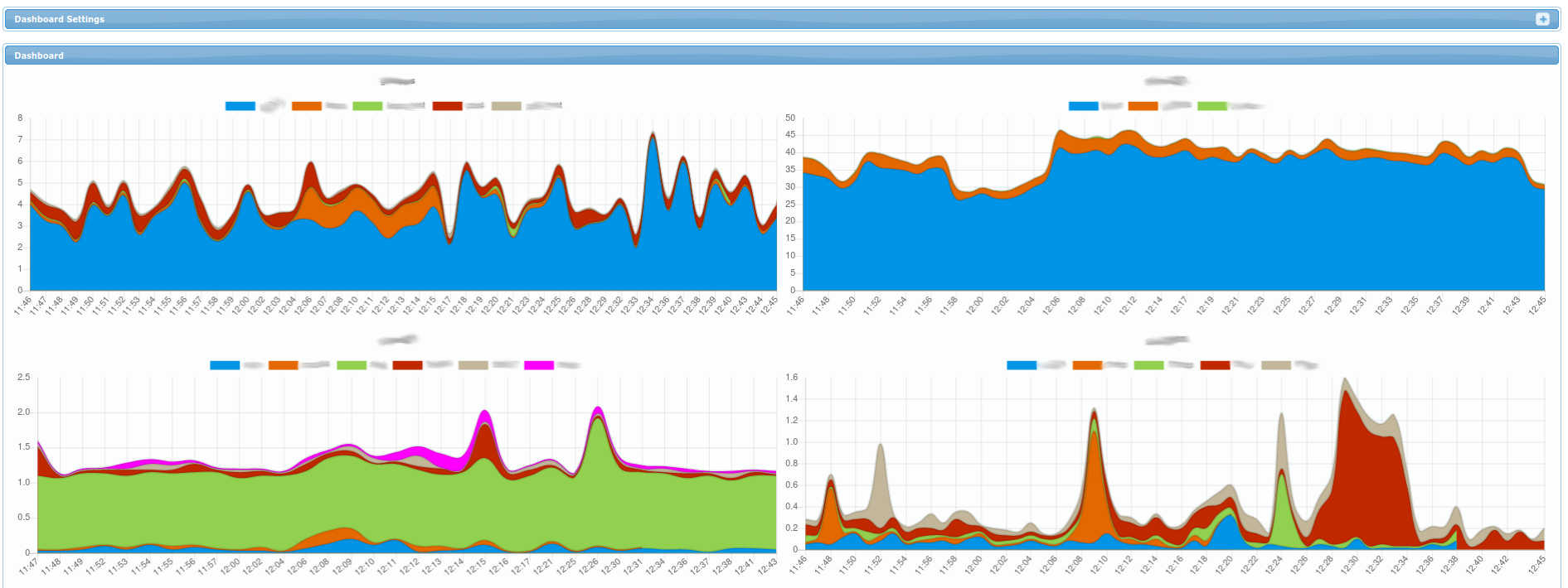
Each chart represents a single server (or cluster of RAC nodes in more advanced setups). Each color represents amount of active sessions for a specific database on that server.
Note that on right top corner, you can click the + on the top right to display Dashboard Settings
panel (it allows you to set time interval for which the charts are displayed - by default for
the last hour).